Quilts by the Bay was hosted by the Monterey Peninsula Quilters Guild in Pacific Grove, CA May 2-4, 2025. I attended with my husband and we very much enjoyed the show.

Quilts by the Bay was held in an historic building called Chautauqua Hall. Based on its age Chautauqua Hall is a rustic building and the quaintness blended well with the theme of quilting being an age old art. From the website:
Chautauqua Hall was built in 1881 by the Pacific Grove Retreat Association for presenting concerts and entertainment of the highest caliber. The building was restored in 1988 and 2005 after having been declared a State Historical Landmark.


I chuckled at the ingenuity of signs directing viewers to the show. Hanging from the beams of an arbor was fittingly fine but ... being hung on a dumpster ...?


Childlike Fun Quilts (3)
On the entry aisle to the show I was immediately attracted to a Wizard of Oz inspired quilt by James Potts titled There's Sew Place Like Home. I loved the detail of the blue gingham binding that harkens back to Dorothy's dress and when I mention that to the guides at the show they were pleased that I had noticed and spoken up. They regaled me with a story. Apparently that binding which had been cut on the grain when attached looked wobbly and distracting. Based on guild member input, James removed it and replaced it with a bias version of the blue gingham. What a difference! I also noted with delight the rainbow in the lower left corner. The backing too, is very fun. The story card reads:

Adjacent to the Wizard of Oz quilt was Mr. Rogers' Neighborhood, also by James Potts. I was bemused that the quilts journeyed was from one land to another, all in the first aisle of the show. The bold primary block house around the perimeter was so very appropriate in my opinion and I liked the subtle backing. The story cards reads:


Keeping the somewhat juvenile them was this bold graphic quilt titled Play a Game with Me by Laura Lawrence. The story card reads:
Foundation Paper Pieced Beauties (5)
My daughter is really excited about foundation paper pieced quilts with sharp points and many pieces by such well-known designers as Jacqueline de Jonge and Judy Niemeyer. In fact, in July she and I will be taking a three-day class in Oklahoma taught by Jacqueline de Jonge. I snapped photos of five of these type of beauties at the show. I included the story cards for the two quilts that had them. The story card on Alternate Paths by Sara Lyon from a Be Colorful pattern by Jacqueline de Jong reads:


Marcia's Puzzle by Marcia Given was based on the design Escher by Christopher Weinhold

Scrapple by Janet Bruman really caught my eye as an imaginative use of a red/black/gray color combination. Her story card gives an interesting background and parallel:
A Dent in the Stash by Layne Rahbar is from the Sew Kind of Wonderful's pattern Posh Penelope for Sew Kind of Wonderful. I have several of the Sew Kind of Wonderful Rulers, but have I used them yet? Nope. Quilt shows have a way of reminding me of the underutilized tool treasures, as well as fabric gems, in my home stash. Layne's story card reads:
Dear Jane Goes Dotty by Nancy Holinski (from Brenda Papadakis's Dear Jane book) makes me wonder how many people in the world think all quilters are a bit dotty to cut up fabric into little bits just to sew it all back together. Nancy's unifying feature of dots gives this quilt a whimsical flair that I loved since I too have a penchant for dots. I would not do such tiny piecing, as much as I love piecing, but I can really admire Nancy's persistence. I included a closeup of a few blocks. Nancy's story card reads:


I found arranging the hexagons in the quilt for my daughter to be a challenge for a smooth flow of color. My struggles are documented in my blog post called Hexagon Heaven or (Hell?) dated 8/10/2020. I needed to resort to inserting solid equilateral triangles in jewel tones to calm down the cacophony of far too many colors. I truly admire the success of Chris Beach in her previously cited Wishes in the Water. The completion post for my daughter's quilt can be found in my blog post dated 10/16/ 2022.


The following quilt about loggerhead turtles had its own story card as part of the quilt.


Western Flyer; Past, Reconstruction, Future made me smile because I liked all the details - such as the rigging, the school of fish, and the sonar and I learned some information I had not known before. Plus, my husband really liked it. I googled Western Flyer and learned that the ship is best known for its expedition to the Sea of Cortez in 1940 with author John Steinbeck and biologist Ed Ricketts. In April 2023, Western Flyer won a prestigious boat award. The Western Flyer Foundation has been restoring the vessel for marine science and education. The story card for Western Flyer; Past, Reconstruction, Future by Dan Garret reads:


On the entry aisle to the show I was immediately attracted to a Wizard of Oz inspired quilt by James Potts titled There's Sew Place Like Home. I loved the detail of the blue gingham binding that harkens back to Dorothy's dress and when I mention that to the guides at the show they were pleased that I had noticed and spoken up. They regaled me with a story. Apparently that binding which had been cut on the grain when attached looked wobbly and distracting. Based on guild member input, James removed it and replaced it with a bias version of the blue gingham. What a difference! I also noted with delight the rainbow in the lower left corner. The backing too, is very fun. The story card reads:
"There's Sew Place Like Home" is a love letter to The Wizard of Oz — a movie I've adored my whole life. The moment I saw this pattern form Art East Quilting Co., I knew I had to make it. Each block brings these beloved characters to life in fabric, stitching together nostalgia, whimsy, and my passion for quilting. Because, at the end of the day there really is no place like home.


Adjacent to the Wizard of Oz quilt was Mr. Rogers' Neighborhood, also by James Potts. I was bemused that the quilts journeyed was from one land to another, all in the first aisle of the show. The bold primary block house around the perimeter was so very appropriate in my opinion and I liked the subtle backing. The story cards reads:
I've been a lifelong fan of Mister Rogers — his kindness, his wisdom, and the way he made everyone feel special. Like him, I'm an ordained Presbyterian minister with a passion for teaching. When I saw the Riley Blake panel I knew had to make it. The quilt is a tribute to his legacy, a reminder that we all need to hear the words: "I like you just the way your are."


While daydreaming about quilt designs, I envisioned a quilt that could be used as a game board. I stumbled upon the Ruby Star Society pattern called "Game Night". I made the quilt as a part of a "sewalong" in 2024. I envision spreading this quilt out on the floor, on a bed, or on a table for children to play made up games or zoom toy cars around the track!

Foundation Paper Pieced Beauties (5)
My daughter is really excited about foundation paper pieced quilts with sharp points and many pieces by such well-known designers as Jacqueline de Jonge and Judy Niemeyer. In fact, in July she and I will be taking a three-day class in Oklahoma taught by Jacqueline de Jonge. I snapped photos of five of these type of beauties at the show. I included the story cards for the two quilts that had them. The story card on Alternate Paths by Sara Lyon from a Be Colorful pattern by Jacqueline de Jong reads:
My son loves intricate things like the inner mechanisms of old watches. He also loves gems and minerals, so the Stoneridge fabrics suit him. He has been an occasional consultant in color layout and quilting motifs. This quilt will soon replace the frayed and well-loved childhood quilt on his bed.

The story card of Unnamed by Deborah Biller based on Judy Niemeyer’s Prairie Star reads:
Originally meant to be smaller than the pattern, I reduced it to 75% (with permission) but then my husband thought we should keep it, but it was too small - so I added enough to make it as queen-sized rectangular quilt. The flying geese are applied on top of the fabric rather than utilizing the usual pieced-in method.

Coral Reef by Karen Learned is based on a Judy Niemeyer pattern design. The color choices and swirling motion surely are eye candy.

I liked the pieced background underneath the paper pieced spiral overlays in Untitled — a Mobius Radial Quilt by Linda Herrera from a design by Audrey Esarey.

I liked the varied dark background of the blocks from a Judie Niemeyer design in this quilt titled Riptides by Karen Learned. The swirling motion with the churning background are design features that support the naming of this quilt.

Traditionally Pieced Quilts (7)
Piecing is my first love so the following seven quilts impressed me. Barn Star by Rita Jacques was based on the book Barn Yard Sampler by Shelley Cavanna. When I googled more info about this book I learned that — surprise, surprise — I had purchased it in October of 2024.
Piecing is my first love so the following seven quilts impressed me. Barn Star by Rita Jacques was based on the book Barn Yard Sampler by Shelley Cavanna. When I googled more info about this book I learned that — surprise, surprise — I had purchased it in October of 2024.


Scrapple is a traditional Pennsylvania Dutch dish, resembling a meatloaf. It is made from the "leftover" after butchering a hog (head, feet, bones, etc.) that would more ordinarily be discarded. This quilt was likewise made from the pieces that would more ordinarily be discarded: the small scraps, cutoffs, trimmings and other "leftovers" from earlier projects. Many pieces were small than 5" square, none larger that ¼ yard; most blocks were designed using the pieces available.

I don't often buy patterns, but this one kept popping up on Pinterest and said "You should buy me." I pulled about 180 fabrics from my stash. After only using a couple of small squares from each fabric, I realized I wasn't making much of a dent. It needed to be bigger so I added a border that I designed.

Brenda's book had no instruction or measurements other that a 4½" diagram. Each block was a challenge. When I had 43 done, so was I. "Jane" was an amazing and patient woman.


I love the cute design style of Stacy Iest Hsu so this sheep quilt from her Baa Baa Sheep pattern appealed. Stacy Iest Hsu's designs are described as whimsical and sweet. The variety of tiny mini-floral prints of each sheep selected by the maker Patty Menweg, are so adorable and appropriate. I loved the colors and workmanship of this quilt by Pat Menweg but I cringed slightly at the title What the Flock. My husband thought the title was clever though, so to each his own. I still really am drawn to and impressed by the quilt itself. I have made many of Stacy's panel toys multiple times for my grandchildren and other kids and have included an image of them in this post.


Wishes in the Water by Chris Beach uses a hexagon block creation technique that I myself used for a quilt for my daughter completed in October of 2022 titled Masquerade. Be sure to check out the closeup of hexagon for construction for Wishes in the Water. Chris's story card writeup is awesome and a real mood-setter.
"Wishes in the Water" is a quilt inspired by the quiet magic of a wishing well - where hopes are whispered into still waters and sunlight dances in the ripples. Shades of watery blue mingle with the golden and yellow hues, evoking the shimmer of coins resting beneath the surface and the glow of light filtering through. Each stitch carries a wish, a memory, or a moment of peace. This piece is a celebration of hope, light, and the beauty found in quiet places.


Appliqué (3)
I am not fond of doing appliqué but I sure can appreciated the skill of those who pull it off. Here three quilts that impressed me. The precise quilting around each little leaf of I Am the Vine, You Are the Branches was done by Sally Miller. The story card for this quilt designed by Jan Mason reads:
The Bible verse, "I am the vine, you are the branches" was the inspiration for this quilt made by quilters of the First Presbyterian Church of Monterey. The quilt is a "snapshot" of our faith community from approximately September 2022 until February 2024. Each leaf represents an adult and the children are the "fruit of the vine". The quilt is lovingly dedicated to the memory of Joan Hughes, founder of the quilting group, our mentor and friend.


The following quilt about loggerhead turtles had its own story card as part of the quilt.


The A Partridge in a Pear Tree submittal by Gloria Hatton was inspired by a Christmas card. I think the gold gilded fabric makes all the difference in this piece. Purely from my memory I estimate this quilt to about 11" x 14".

Miscellaneous Small Items That Just Made Me Smile because... (5)
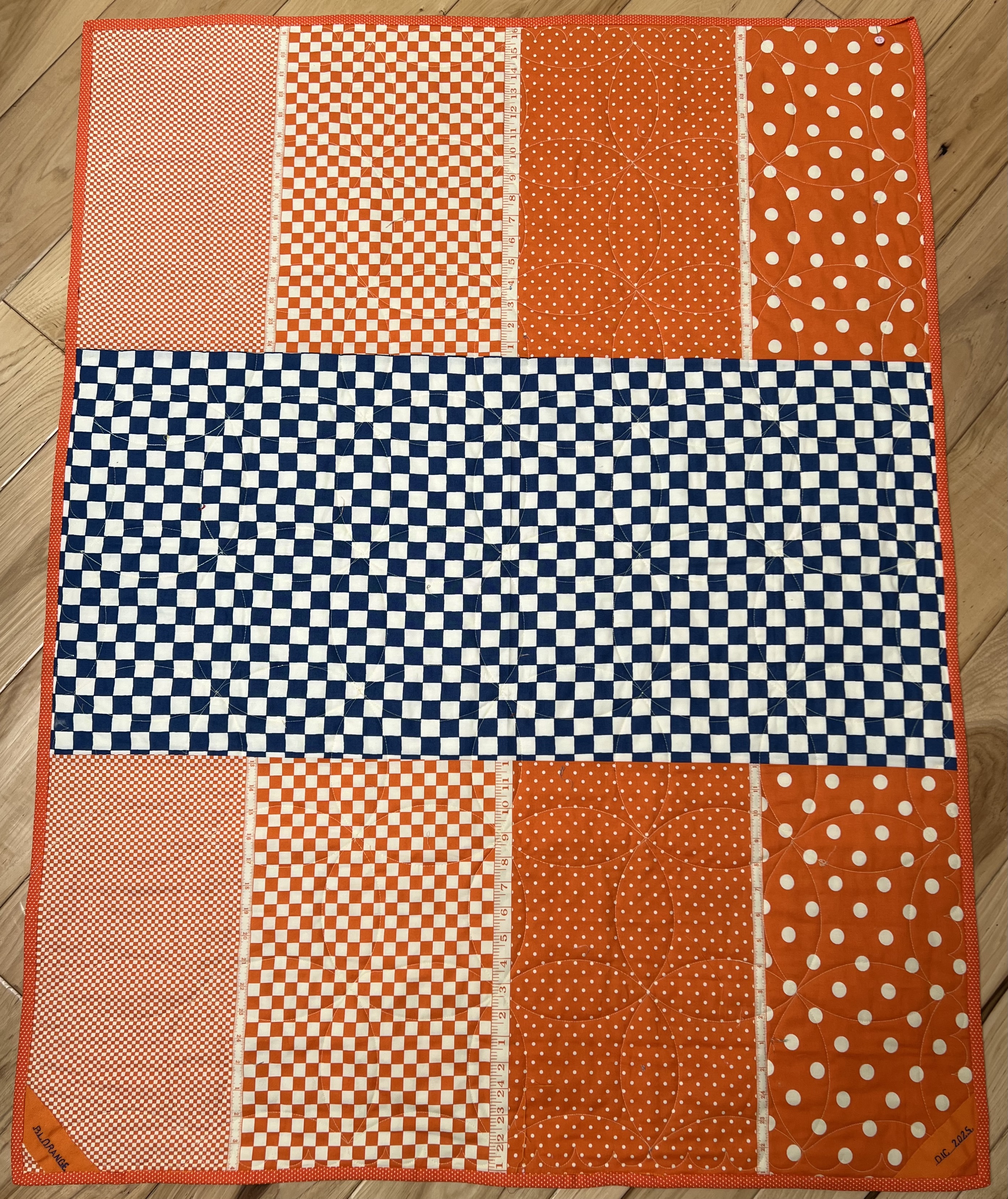
Shircles by Linda Branting just made me smile because of the name (shirt + circles). Shircles reminded me of a blue and orange quilt that I just completed and named Blorange (post for 4/23/2025). I included Blorange's photo. Shircles and Blorange are quite a contrast with circles and squares. Shircles' story card reads:
The top of this Out of the Box Group Upcycle Challenge Quilt is made entirely of the hand-dyed bits of my husband's retired business shirts, machine pieced and machine quilted then topped with hand appliquéd trapunto circles.


Recycling Mom's Crochet by Gudny Campbell made me smile because it reminded me of my own mom's crocheting projects. I'd only seen her creations in white or ecru but it set me to wondering if my mom had had color options for her thread and never exercised them. The story card for Recycling Mom's Crochet reads:
My mother made the white crochet placemats which I painted and recycled in the quilt. The ribbon was the inspiration for my design and colors. I pieced and quilted it, then added yarn and beads.Out of the Box Challenge

Quilted Ladies by Linda Herrera made me smile because I live not far from San Francisco and have seen these colorfully painted homes. The details in this small quilt are exquisite down to the lace and embroidery on the houses and the strings for cables on the Golden Gate Bridge in the background. Quilted Ladies's story card reads:
Quilted Ladies AKA the Painted Ladies of San Francisco. They are symbolic of the California Gold Rush.No Strings Attached 2025 Group Challenge "Gimme Shelter"

Andrea (https://wwwthelocalnaturalist.com) created a t-shirt design as a fundraiser for the Western Flyer Foundation. A color in her design matched the color (Julep) of the Under Sea Challenge. I emailed her for permission to use the design and got an immediate yes! We kept in touch as the quilt developed and she saw it at the Monterey County Fair (2024).


This made me smile because the quilts get all the credit (as they should) but this ribbon is a joy to behold with all the layers of ruffles and shades of gray. It goes to the person who machine quilted the quilt. My review of this show contained 23 items so I kept pretty close to my 10% goal.

Fabrics
Although there were no vendors at this show there was a row of scrap bins, free for the picking. I pulled out two Christmas panel sections which I plan to use for placemats for Meals on Wheels. The scrap of cherry red is for a month block input for my small group. There were also two rooms with fabric donations from estate distributions, priced at $8/lb. Four yards of the pink dragonfly print cost me $12. I will store it away and use for a backing some day.


Great Show Well Worth the Trip
The members of the Monterey Peninsula Quilters Guild are to be commended for the outstanding job they executed with this show. They have a really cute logo, too. It is so representative of those cypress trees bending along the shorelines
The members of the Monterey Peninsula Quilters Guild are to be commended for the outstanding job they executed with this show. They have a really cute logo, too. It is so representative of those cypress trees bending along the shorelines