Showing posts with label MainCrushMonday. Show all posts

Monday, August 10, 2020

Hexagon Heaven (or Hell?)

This quilt was to be for my daughter's wedding. She and her husband will be celebrating their tenth anniversary next May. I told myself if I do not finish this quilt now, when I am forced to shelter in place during COVID, I never will. I put all the extras leafs into my dining table and set up an additional table along side it. My husband cut me four blocks of wood so the two tables could be at approximately the same height. I spread out the 169168, 169, 170, pairs of half hexagons – counting and recounting, even with the help and cross-checking of my husband, did not give consistent results.  I surveyed the scene, scratched my head, snapped a photo, and texted it to my daughter with the rhetorical question, "Can this ugliness be saved?".


It all started with the book One-Block Wonders and a multi-colored Mardi Gras mask print my daughter fell in love with. In my last post on this quilt – nine years ago on October 19, 2011 – I described the fussy cutting and assembly of all those half-hexagons. Then I stalled at assembling it into a beautiful, flowing creation as shown on the back cover of the book. Alas, I think the chosen fabric had too many colors competing; trying to corral them into color zones was hard, if not impossible, for me to execute. 


With renewed inspiration and increased resolve, I thought that maybe if I concentrated on individual hexagons and accented them with jewel tones drawn from the print I would be more successful.

I grouped a quartet of similarly patterned hexagons, planning to combine the unit with a companion color. Some quartets were not so obvious and had a outlier (or two) but I made a best effort.


Some quartets did not have an obvious dominant color. There were a lot of browns and blacks that did not excite me; nor did I want to feature them. First, I did the quartets which displayed an obvious companion color – "picking the low-hanging fruit" as the saying goes. Adding a solid triangle on opposite corners, I arranged the foursome of hexagons in columns of medallions. First I aligned two teal columns with each other. I considered adding a teal sashing between them.


Next I added pink and noticed I could offset the columns and see a secondary star pattern emerge.  I forged ahead with purple and orange. I really like the orange medallions since they pop so well, though technically, orange is not a jewel tone.


Then I realized if I spaced the columns apart with a kind of "transition" column between different colors, I might be able to extend those secondary star patterns. I explored using the jewel tone solids but then I realized I possibly had enough mask fabric hexagons to use them instead. I would need to be careful to place the "correct" color star-extending triangles on the outer edges."Transition" columns are grey in the diagram that follows the photo.


I will have to pay attention and plan what color triangles I add and where they go on those hexagons. The challenge will be to do this without a large enough design wall. Making the quilt in sections and relying on my trusty PowerPoint diagram is my workaround. Gretchen Rubin tweeted this quote with the accompanying image. This flowing cloud of color hints at my original optimistic dream for this quilt. Eisenhower's famous words remind me to be open to the results and not get hung up in analysis paralysis.


To keep myself honest and motivated, I am sharing my planning now with Cooking Up Quilts' link party MCM #187.

Monday, July 13, 2020

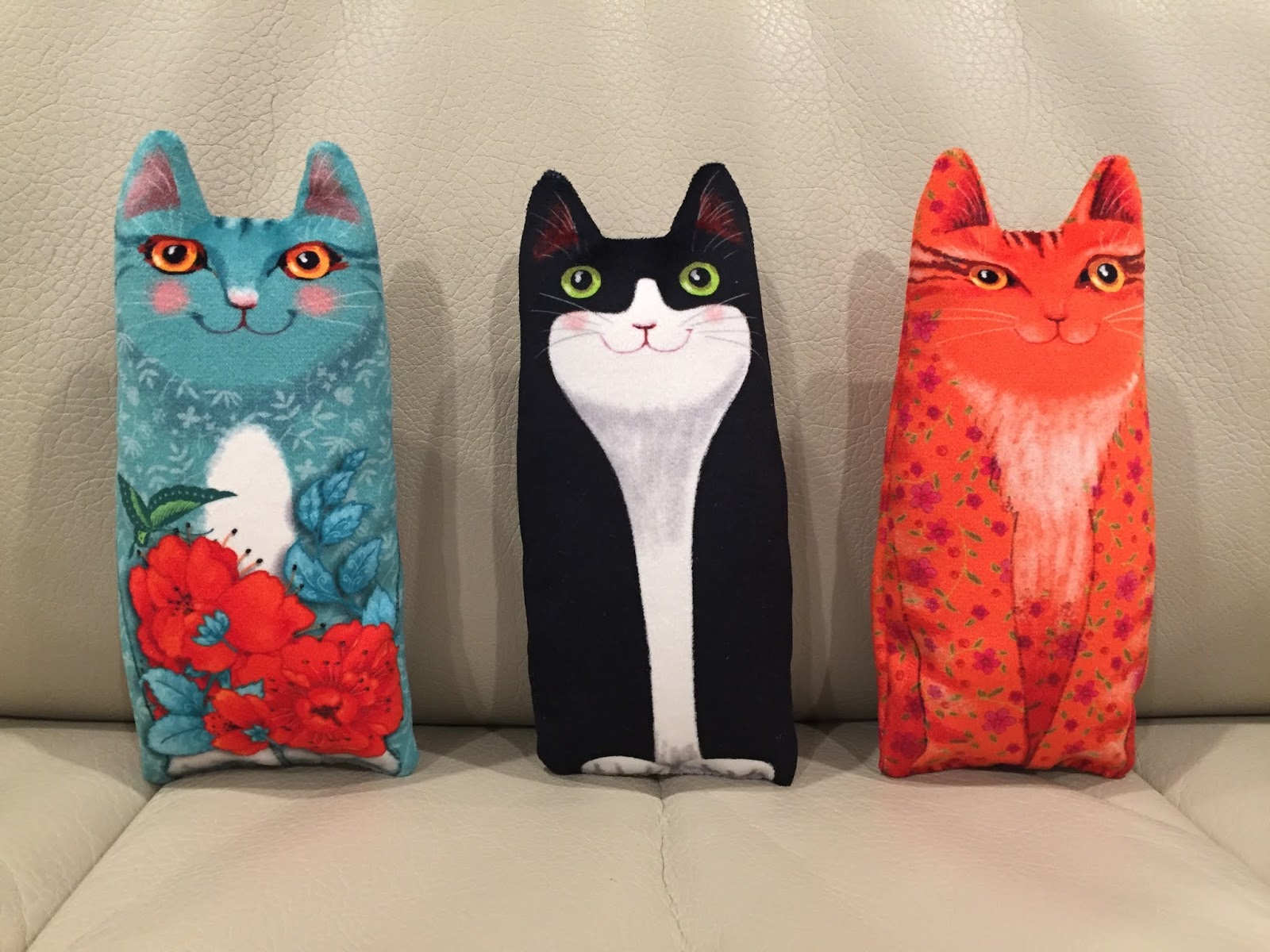
Three Little Kittens

After a big project completion I need a smaller one for instant gratification. I liken this practice to a palette cleanser between courses of a big meal. These three small hand-sized stuffed velvet kittens did the trick after my completion of Fifty Shades of Taupe in my previous post. I bought this kit of a trio of kittens, made in France, from Renaissance Ribbons. The fabric is a heavy duty 100% polyester velvet that is so soft, smooth, and appealing to the touch it reminds me of the silky fur on the tummy of a six-week old puppy. Each kitten comes in its own package™ with a one page instruction card written in French. Luckily the diagrams told me all I needed to know.


Construction is simple. Two sides of the front view of a kitten are sewn right sides together, turned right side out, stuffed, and then whip stitched closed at the base. Because the fabric has a heavy almost rubberized backing and is slippery on the front when the two right sides are against each other, I used Clover Wonder Clips™ to hold the two pieces in place while stitching around the perimeter.


My trusty tools for turning and poking out corners came to my rescue, even for the thick fabric.


The three kittens were given French names: Filou translates to Trickster, Plume means Feather, and Lune is equivalent to  Moon.


My husband has been wanting to get a cat for quite a while so these will need to do in the interim. They feel very much like stroking a real feline. I am sure, though, that he will insist they are far from an adequate substitution for the real thing. I insist they are much, much cuter and less demanding.


Each is the perfect size for a small child's hand. I suspect if a grandchild or two visits, I will be quite willing to have one or more kitten travel home in a suitcase. For now they are decor in my family room since they have such tactile and visual appeal to me.


I confess. I thought I was buying an extra kitten for myself when I actually bought another entire set of three. Maybe I will make them up now or perhaps save them for another between-big-projects break. I do tend to like whimsical pillow type accents in my family room. Linking up now with MCM #183 at Cooking Up Quilts...

Monday, June 29, 2020

Completion of Fifty Shades of Taupe

Yesterday was a beautiful, but very windy, sunny day in California, as I sat upstairs in my sewing room by the open window putting the last few stitches in the binding of my Fifty Shades of Taupe quilt. My emotions were a mixture of pride and relief, and yet I was also feeling a bit lost. A quilt is like one of my children. I am proud that they have grown up so well and are thriving on their own. I am a bit relieved that my efforts with them are essentially done, and done pretty well. But I am also a bit lost, needing to find something equally enjoyable, another project to which I can devote my time and creative energy. I must either face a UFO or a blank design wall. So I put off starting the next sewing project and began to write a blog post, instead.


Four previous posts for the creation of this quilt were published on my DianeLoves2Quilt blog on Jun 16Jun 7Feb 6Feb 4, two for assembly and two for quilting.  That time gap between February and June was me subliminally thinking about how I wanted to quilt it. I may have lost a bit of momentum (as I was determined not to do per my Feb 6 post) but I regained it.


My last step before binding is creation of a label. For labeling my quilts I typically embroider my name, the date, and the name of the quilt on grosgrain ribbon and set those diagonally in the bottom two corners of the quilt. Each of the eight memory channels on my Pfaff Triptonic 2040 can hold 20 characters. My name and the year is 19 characters long. So far so good. My quilt name Fifty_Shades_of_Taupe is 21 characters long. Bummer. I knew substituting the number 50 for the word Fifty to spell 50_Shades_of_Taupe was an easy solution but it did not have the same appeal. Christian Grey from the novel Fifty Shades of Grey would not have skimped that way merely for an economy of characters. (My insight into that controversial book is in the first third of my Wander or Ponder post for March 24, 2015.) Then I came up with an idea which in hindsight seems obvious but wasn't at the time. I programmed "Fifty_" into a memory slot and "Shades_of_Taupe" into another memory slot and then sewed one immediately after the other. It worked like a charm and these are the labels I attached to the lower two corners, tucked tidily underneath the binding.


My binding is ⅜" wide and went on very smoothly with no major snags. The final quilt measured 60½" by 79½" so it took me several hours over a couple of days to unhurriedly hand-stitch 280" with music from my iPad playing softly in the background. It is similar to when your child leaves home for college or a job and you are left to reflect.  Hmmm... I noticed from a previous post that the assembled blocks measured 62½" by 82½" so quilting can take up about 2"-3" inches in each dimension on a quilt this size.


This quilt took enough effort (quilting, more so than piecing) that it is going to stick around my home for a while and not be given away. Unlike children, there will be no leaving the nest for this one - at least not in the near future. But then again there are so many quilts at my home I think it is near impossible to empty the nest. Just about every room has a quilt or two to curl up in and read or watch TV. Here are closeups of one corner, a foursome of blocks showing the print variety, and one solitary block. The solitary block is a favorite of mine because of the print and because the lines in the plus are straight, parallel, and equally spaced. I have omitted photos of those blocks whose lines are not so well behaved.


I had to wait until the next day for the wind to die down so my husband could hold Fifty Shades of Taupe outdoors for photos. The sun bleached out the contrast and so we photographed it in the shade. Here are the front and back. 


This quilt does not display my usual array of colors but it pleases me, even though it is outside my comfort zone. The indoor photo, although not straight on, is better for color clarity and tells me that neutrals can be appealing, too, especially if they showcase a variety of patterns as these do! My stretch to solids also shows off my FMQ more crisply, so I need to try a repeat on using non-prints. Fifty Shades of Taupe was a learning experience for me ... but definitely a far different learning experience (blush) from that of Anastasia Steele in the novel titled Fifty Shades of Grey. Still, I like the tongue-in-cheek parody of the erotic novel and I like this quilt! I hope others will like it too when I share at Cooking Up Quilts Main Crush #182.

Sunday, June 21, 2020

Block of the Month Win

My guild hosts an optional block of the month activity where members can purchase a mini-kit which contains a one page pattern and all the fabrics precut to make one quilt block. The following month those who made a block enter their names in a drawing, once per block. Some members make more than one block if they are ambitious or really like that particular month's offering and so want multiple chances. A name is pulled and the winner gets to take home the blocks and assemble them into a quilt. Last month I finally got around to assembling the blocks I had won from the June 2017 contest. From June 2017 until May 2020... it only took me three years.


I arranged the sixteen blocks, aiming to distribute the strongest colors, the hot pink and the deep navy, evenly throughout. This is my result.


It only measures 32" x 32", too small for my guild's minimum guideline, 35" x 36", for an infant sized community quilt. Had I been more alert I would have simply added a border all around. But I did not. I guess it will become a table topper or a doll blanket for my own grandkids. One benefit of the small size though, was that it was a handy palette for practicing my FMQ. I dare to be less timid and used a pale blue thread on white for the stitching. I chose a bright geometric backing from my stash and a mottled blue/green fabric for the binding.


There is no fancy label, merely a subtle printing of my initials DIC and the year 2020 written in two lower corners of the front. Hmmm... that turquoise blue pigment pen is perhaps too subtle. I may darken it. Since I only made four of these blocks, I hesitated to take credit for this completion. But when I saw it in my previous post about displaying quilts, I decided it needed a small explanation. Besides after my posts about FMQing my quilt Fifty Shades of Taupe (6/7/20 and 6/16/20), I acknowledge that assembling the quilt top is not always the bulk of the work. Sandwiching, FMQing, and binding take a lion's share of the time to finish a quilt. For this one, I did compromise by attaching the binding to the back, wrapping it forward, and machine stitching it on the front. Aah... 100% complete!

Saturday, June 20, 2020

Third Saturday of June 2020

On the third Saturday of the month my quilt guild has begun a tradition of hanging quilts in the front of their homes as a source of enjoyment for the community and as a thank you for the essential workers during the pandemic. My April display was described in my post for 4/22/20. For the month of June, we were asked to hang quilts which leaned toward a masculine theme for Father's Day. This was my display for June. After each photo are the names of the quilts and a link to a post that tells more about each.


In front of garage doors from left to right
  • Tool Quilt whose poem reads a few of my favorite things 2/18/2012
  • Thimbleberries 1/7/2015
  • Train quilt from 2008 in refrigerator car colors for husband's 60th birthday 7/24/2018


Patriotism near front door
  • American flag on bench (pre-blogging therefore earlier than 2011)
  • Blue and white mystery quilt at top (pre-blogging therefore earlier than 2011)
  • Debbie Mumm 40"x40" table topper second down 3/31/2014 (second half of post)
  • Quilt from scraps third down (pre-blogging therefore earlier than 2011)
  • Quilt assembled from winnings from guild June 2017 Block of the Month 9/11/2017
  • Painted barn quilt board 2/11/2020
This monthly tradition is fun and makes for a lot of reminiscing. But I do wonder... what happened in May 2020?

Tuesday, June 16, 2020

FMQing Borders and Sashings

This is my fourth post about a Taupe/Gray/Cream/Black quilt that I have since named Fifty Shades of Taupe. My previous 6/7/20 post for this quilt addressed the FMQ on the main central area of its 35 blocks, where I tried my hand at clamshells and my rather unsteadier hand at long straight lines. Both of those chosen patterns involved ruler work, and so I was ready for something more relaxed. The original version of the quilt in the Spring 2013 edition of McCall's America Makes Fast Quilts suggest feathered vines in the borders. I felt the feathered vines would not complement the clamshells and would barely show up in the busy print of the border.  I thought a piano key border would echo the plus sign within each block. I know. I know. I wanted a break from ruler work. But I reasoned these would be shorter lines, farther apart, not as many, and closer to the edge so easier to work.

In a class taught by a HandQuilter educator, I learned it works better to go up and back on parallel lines before shifting the ruler, as opposed to up-shift-down-shift-repeat. It is not difficult to trace the stitching over the same line and I think it defines it better as well.  To make lines 1" inch apart, I again used my Angela Walters Slim ruler but for the 1" apart border lines I added a ½" echo foot attachment to my hopper foot, same as I used on a caterpillar quilt in my post for 4/11/20. One problem I had though, was that the pink extension rubbing against the ruler squeaked horribly, like nails on a chalkboard. I assumed I was pushing the ruler too hard against the pink ring, but much less pressure and I would lose the guidance advantage of using a ruler. I had not had this difficulty –  perhaps occasionally but not to the extreme –  with the metal hopper foot alone. I worried too that I would abrade away either the pink echo foot or the clear ruler or both.


After working for a while I rethought the issue, since the squeak was a real stress builder. What causes a squeak? Friction. What do you do for a squeaky hinge? Oil it. I decided to put a bit of Sewer's Aid on the foot and the ruler. I put a tiny drop on my finger and ran it along both surfaces. The noise went away instantly. Sewer's Aid by Dritz is designed to be spread on the machine surface to make fabric glide more easily when FMQing on a domestic, so it does not leave any oil stains on the fabric. It worked like a charm and I only had to apply it once. It took me two days of sewing to do the four sides of the border. I did not rush it and was pleased with the results


Next I needed to address the pale gray 1" sashings. I was hopeful that they were narrow enough I could leave them not quilted but they looked naked. The Spring 2013 edition of McCall's America Makes Fast Quilts suggest circles in those 1" strips.  I am terrible at circles so I needed something else. The design had to be symmetric left/right and up/down since at the corner intersections a directionality would be problematic. I decided on an orange peel motif. The pattern could accommodate where the four sashings met without a directionality issue.


The curves of the orange peel complemented the clamshells and eliminated a lot of stitch in the ditch tedium which for me is prone to whoopsies. Since there were no rulers involved, the stitch lines are "organic", the polite word for not perfect, slightly varying. 


Not all friction is bad. Sticky is good too. Yellow masking tape marked as a tape measure adheres lightly to my quilt top, helping me evenly space the orange peel units. Holding it in place with my fingertips as I quilt, I generally have to place it to sew only the first side of the sashing, eyeballing the spacing of the second side based on the first. It remains tacky enough to use the same piece over and over again. I conveniently stash it up on the wall when not in use. Using tape this way eliminates any need for marking. A strip or two of ordinary plain masking tape up on the wall is my spot to toss strings I snip off. Again, sticky to the rescue.


The following photo shows how the piano key border, the clamshells, the orange peel in the sashings and the long lines in the plus signs all work together.


I was able to piece this top in a day but I have since learned to acknowledge and accept that the quilting takes much longer. But the FMQ skill is what I need to build, so I put on some music and try to relax with it. I am still tense and tight in the shoulders as I sit at my HQ Sweet Sixteen but I am getting less uptight as my confidence builds. Every quilt has whoopsies. I am learning not to fear them now. The worst of them can be removed; the lesser ones are really not so bad and can be allowed to stay if you let them marinate for a day or so. Here are two I did pick out. With a little bit of steaming or misting and rubbing, the needle puncture holes go away.


I have completed four rows of five blocks each for the sashings. I need to complete the other three row of the seven rows. I have just shy of three days invested in orange peeling the sashing. If I do not take breaks and take my time I get sloppy. For now I will link up with Main Crush Monday #180 at Cooking Up Quilts.

Tuesday, May 19, 2020

Polar Pals Panel Pillowcases

Yes, I make a lot of pillowcases! But this one is different because I made it from a panel. The WOF for the panel is sufficient for the 41" needed to wrap around the pillow; but the panel is only 24" wide and 27" is needed for the the length of the body of a standard pillowcase.


I would need to add 3" and do it in such a way that the seam was enclosed and did not make a lump under the face of the sleeper. I did not want any of that Princess and the Pea effect. So I used a flat-fell seam like is in jeans.


The fabric I used for the extension was the same I used for the border. I found a wavy stripe in my stash that went perfectly, of which I'd bought 1 yard just because I liked. I bought the panel at a totally different point in time from a different place. It is not odd (odd = weird) that they matched because they were from the same fabric line; but it is odd (odd = funny) that I was not aware they coexisted in my stash.


Once I was inspired to make the pillowcase, I decided that I needed a second panel so the top and bottom could be showcased on two sides of a pillowcase pair. I found and bought a second panel on Etsy. Here are the two panels made up into two pillowcases. The top of the panel is on the left pillowcase; the bottom of the panel is on the right pillowcase.


A subtle yellow dot print perked up the pillowcase as a accent strip. I chose not to insert an accent strip at the flat-fell seam so there would be no bump there. Similarly I opted not to make the extension larger and the border smaller to attain symmetry. Why I did not do that was the first question my husband asked. I explained that offsetting the flat-fell seam to make a longer extension moves the seam further toward the center of the pillow, possibly under the face of the sleeper. Asymmetry also makes it easier to identify which end is the opening for inserting the pillow.


If the sleeper does choose to make that grey stripe line up, the pillows can be turned to match either the tops of the two panels or the bottoms.


I knew I bought that panel in a moment of weakness just because I thought it was so cute. Now that I have found a way to justify those type of impulse purchases, I am going to keep my eye out for other panels that will lend themselves to pillowcases like these. Hmm... guess I am going to have to buy two panels instead of one. Perhaps my friends at Cooking up Quilts MCM #176 will agree with this philosophy.