Sunday, December 30, 2018

Blue Hues Finish

This laser cut quilt kit, designed by John Flynn, was among my purchases at the Houston Quilt Festival in November 2017. I began it in January this year and was determined to finish it in time to count it as a 2018 completion. I had all the FMQ stitched in early December and all I had left to do was the binding. I could claim that the holidays got in the way but that is only partially true. I was hung up on a name. By my self-imposed demands for completion, I have to put a name on a label and put two labels diagonally on the corners of the quilt before I add the binding. Previous names I rejected are Carnival (original non-descriptive sale title), Webs and Wheels (descriptive but I dislike spiders), Petalmania (unexciting and not really descriptive), Out of the Blue (already used 8/16/17 post), Roundabout (sections look like traffic rotary and I went round and round about how to quilt it per 12/4/18 post).


Here is my thought process for the final selection. When the name was right, I knew I would just feel that it was right. The Houston Quilt Festival was extra special to me because I attended it with my daughter Robin; so maybe I could get commemorate our time together by getting Houston in the title. I rejected Houston Blues because it sounded sad. Then I explored Blue Houston and asked myself what if I shortened that to Blue Hous? But everyone would pronounce it Blue House. What if I spelled it differently? Blue Hues? That had a double entendre meaning and I would know that the hues was also short for Houston. It sounded right. It felt good as it rolled off my tongue and it fit the quilt. It was faintly familiar and that may possibly be because of a Nickelodeon Kid's show Blue's Clues.


I had made my binding months ago and had succeeded in not misplacing it, so I was ready to roll on that front. Name decided, I embroidered my labels on my Pfaff. I do not own a fancy embroidery machine and that is ok with me. The lettering on my Pfaff on some pretty colored grosgrain ribbon is all I need. That is another decision that must be made but it is fairly simple. (Decisions are what slow me down in my quilt-making.) I go to my local fabric store and buy the closest option that is in stock. Here were two choices I brought home, shown auditioned on the back of a test block with a length of my binding.


I place a sheet of paper piecing paper underneath the grosgrain ribbon when I do the lettering. I also use a special foot that has a central groove allowing the thicker letters once embroidered to pass back beneath the pressure foot more easily.


This particular ribbon is wider than the feed dog spacing so the sheet of paper, although not truly necessary, helps feed the ribbon in more evenly. I also disengage the even feed capability. I say all this in my blog because inevitably I forget one of these tips and the lettering gets stuck or comes out catawampus and I need to try again.


Uh-oh. Here comes another potentially time consuming decision. I typically put the labels on the two lower corners of the quilt and I wanted this quilt to be portrait format, taller than wide. But which side is up? Which side do I want to be the top? I asked my husband and he immediately knew the "right answer". He quipped, "Of course the lighter blocks should be up so it is not top heavy." My knee jerk reaction was "Huh? Lighter blocks?" But when I stepped back objectively and took in an overview he was right. (He reads my blog and will be pleased to see this admission in print.) 


I put the labels in the two corners that have the quarter circles, now declared to be the bottom.


My husband gave me this T-shirt as a Christmas present. He will play out his role as I present the following completion pictures. So as to prove his participation in this endeavor, I will be sure not to crop out his feet from the Blue Hues photos.


The following full-on view of Blue Hues features my husband's feet at the bottom as promised. The four block by five block layout measure 48" by 60".


An angled view with shadowing from the sun shows the FMQ a bit better even when the thread color and fabric color are low contrast with each other. The following photo also features my husband's left hand and right fingers in addition to his feet.


I like the appealing texture on the back from my FMQ.


Here is a closeup of the back. 'Tis not perfect FMQing, but practice does indeed lead to improvement. I think the current in-vogue term for perfectly-imperfect is organic. That's it. It is organic! But it sure did take a lot of thinking on my part to look casual.


Following is the history of posts for this quilt, which show my thinking process. 
  • January 10, 2018 where I discuss curved piecing
  • February 23, 2018 where I decide on a block arrangement
  • March 1, 2018 where I challenge myself to get a backing from too little fabric.
  • October 24, 2018 where I correct the sandwiching and start FMQ on the ⅛ circle sectors
  • November 29, 2018 where I audition FMQ patterns for the "horn shapes"
  • December 4, 2018 where I finish up the FMQ on the "horn shapes"
  • December 30, 2018 (this post) where I decide name, add labels, and bind
I'd challenged myself to complete Blue Hues before the end of the year so I could include it in my 2018 in Review post and I succeeded! Linking up to Let's Bee Social #256.

Wednesday, December 26, 2018

Twelve Cats of Christmas

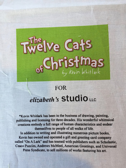
I bought this The Twelve Cats of Christmas cloth book panel at at a quilt, craft, and sewing festival in February 2014 during my "buy every cloth book you see" phase. At the same time I also bought a panel for a cloth book titled The Twelve Dogs of Christmas. I recently made up the canine version into a set of six placemats, written up in my post for 12/17/18. This post is very similar to that one for the dogs. I made this panel up into six placemats also.


The lyrics are delightful, a parody of the Twelve Days of Christmas, but I felt that I missed my mark by letting this fabric linger too long in my stash. My daughter's children, ages 3 and 6, are too old for cloth books, but the family does have two cats. I repurposed the panel into a set of six placemats. I've previously repurposed a cloth book into a graphic novel for this family, a process I detailed in my 11/19/14 post for The Mitten. (Although too old for a cloth book, a graphic novel like their dad reads was more acceptable.)


This "book" comes from a panel printed by Elizabeth's Studio. I gravitate toward the fabrics of this mill who adapts the artwork of talented artists into screen printed images. These illustrations of twelve cats in various poses is from the work of artist Kevin Whitlark.


I chose to border the pages of the book with a grass green fabric by Stacy Hsu for Moda with images of bottles of milk. It is from her line Farm Fun. It wasn't until I was taking pictures of the selvages for this post that I noticed the designer. I love just about everything by Stacy Hsu. I am not surprised I bought this fabric "just to have" because it called to me.


I wondered what to use for the backing. This gift print had the right green, the pinks and reds echo the panel illustrations, and the gifts seems to fit in perfectly with a Christmas theme. The panel and both the border and backing fabrics came from my stash. It is a good feeling when you find exactly what you want within your own shelves and drawers.


The panel consists of six double book pages, ordered so they are in the correct sequence when made into a book. I cut them into twelve single pages and regrouped with two on a placemat. I had to do some finagling since the cover pages are bigger and need narrower borders to make all six placemats the same size. Fortunately I had saved the calculations from my set of dog placemats which made my job easier.


In an assembly line process, I layered the batting, the backing right side up, and the bordered cat illustration front face down. Here the six are ready to be sewed around four sides with an opening in the bottom for turning. The first and last placemats in the staggered stack have thinner side borders and narrower top and bottom borders because they came from the book cover pages which are larger.


And here are the six completed placemats. They measure slightly under 14" high by 18"wide. With those dimensions I get six backings out of one yard of fabric. I topstitched ⅛" from all outer edges and stitched in the ditch in the borders and down the center. I was considering some free motion quilting in the central portion of the panels themselves but did not want to "scribble" over the artwork. I then realized the bamboo batting I used allowed quilting up to 8" spacing. The placemats met that criterion so I quit while I was ahead and declared them finished.


In case the print is not legible here is the summary of the lyrics:
  1. a fat mouse in a fur tree
  2. two tomcats twisting
  3. three fluffy Persians
  4. four floating kitties
  5. five goldfish
  6. six furballs feasting
  7. seven siamese sailing
  8. eight felines fishing
  9. nine pussycats playing
  10. ten tabbies bathing
  11. eleven moggies leaping
  12. twelves cats a' clawing
For the eleventh day of Christmas I had to look up what moggie meant because I had never heard the term. A moggie is a cat that is not purebred. A moggie is to a feline what a mutt is to a canine. Live and learn. Can you imaging your home if it had twelve cats a' clawing in it? In my humble opinion that is not a great Christmas gift from your "true cat"! But here is a "true cat" belonging to the family about to receive these placemats. Orange tabby Elliot, in my daughter's lap, is allowing himself to be used as a pillow by blue-shirted three-year-old Isaiah, also sharing that same lap. I have shipped these placemats off to Oklahoma but I will also share their construction by linking up with Let's Bee Social #255.