I finished assembling the antlers. I was pleased that I had been able to fussy cut the black and white medallion fabric so the discs were centered along the two horizontal branches and also along each vertical branch.
I also centered a medallion in each eye and in the nose. In retrospect, I was not thrilled with my black/white medallion fabric choice for the facial features. I was so focused on achieving a contrast with the white background for the face that I was hesitant to use the beige floral called out in the pattern. The brown fabric that I chose instead had mini swirls in it that reminded me of fur, but it is dark enough that I lost contrast with the nose and eyes. Or maybe the black print is just too busy. Oh, well. I will plunge on. At the end, if I am still malcontent, I can appliqué or insert a different eye and nose fabric in those three spots. Hmm... maybe blue eyes and a red nose... perhaps?
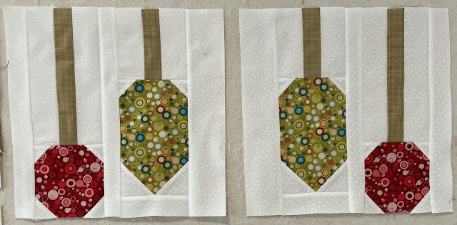
While pondering this decision, I tackled the dangling ornaments in the red (L) and green (M) bubble fabrics with the beige plaid (O) for the hanging ribbons. Here they are the left pair and the right pair. The ornaments are pretty straightforward modified snowball block piecing. They are baubles so, fittingly, I made them from bubbles.
I assembled the deer face with its antlers and ornaments. Then I definitely decided I did not like the black and white medallion fabric for the nose and eyes. I kept the nose as is and did not change it to red. After all, this is a deer and not a reindeer, and so there is no reason for his nose to be red like Rudolph's. However, the eyes did not sit well with me, plus the medallions were not centered the same on the two eyes. I switched the eyes out to blue. This switch made the medallion print nose all the more distracting. I removed the nose and replaced it with solid black. Solid black is not as creative, true, but sometimes safe is more appealing than creative.
I moved on to making the bands of stars. Quite pleasingly, not all the stars were the same. The green and black ones are sawtooth stars and the red one is an Ohio Star. Those quarter square triangle units on the red stars took a bit more time to make, but the crispness of the points really paid off.
This switch to blue eyes was a bit stark being the only blue in the top. I toned it down by contemplating pupils for the eyes. Should I insert the triangles or appliqué them on top? Iron on adhesive was an option instead of needle turn appliqué and would avoid opening up that seam yet again. The seam would get stretched out no matter how careful I was. Also, with the iron on I used only one layer of fabric instead of the four layer bulk created by backed triangles. The black pupil detail was not enough to distract from the stark singleness of the the only blue in the top. I further deflected the distraction by inserting a narrow band of blue in the outer sashings to draw the eye toward the edges as well.
I'd already planned to leave off the black borders to decrease the overall size and also because I thought them too dark and brooding. Here is the assembled top, ready to be FMQ'd. Hmm... more decisions. Decisions are what slow me down. Next post will show FMQ, labels, and binding.


Wow - switching out the eyes and nose was absolutely the right call. I'm also kind of surprised that you just undid enough of the seams to get the old nose out/new nose in, I think I automatically think if I have to undo a seam, I must undo the WHOLE seam. I would not have guessed the eyes were applique when I saw them, but the pupils really prove Jean wells' point about it being not just WHAT colors you choose, but also how much of them you use! The points on your stars are crisp and lovely and overall, I love the bubbles-for-baubles, your selection for antler fabric, and the colors you picked for the stars. Overall, this turned out to be a beautiful and eye-catching make!
ReplyDeleteThank you. I am indeed pleased with my deviations from the original Coriander Corey Yoder pattern.
Delete