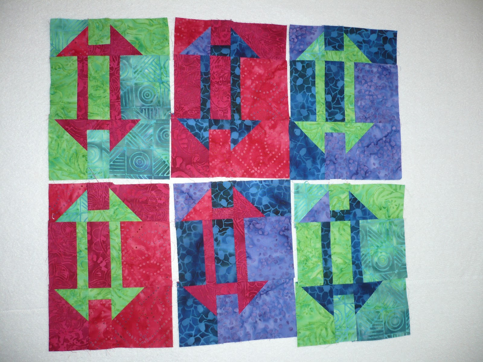
- Alternating the backgrounds between hot and cool colors
- Putting the highest contrast blocks in the center
- Arranging blocks in rainbow spectrum order diagonally
I like to play in Power Point for my assemblies. I can move groups of blocks at a time, rotate groups at a time and preserve the images for comparison side by side. Once I have a general idea I then put the blocks in my favorite configuration on my design wall and do tweaks since the colors are always a bit different in real life than on the computer. Here are the block pix rearranged in several configurations along with the pros and cons. The options all look very similar but I still sweat the details.
I started with alternating the hot colored and cool colored backgrounds to maybe get a checkerboard effect. I soon realized it is not hue variation, but rather intensity variation that I need to get a checkerboard. But I have a hard time seeing past the color. This looks rather random (good for the right brain) but not very checkerboardy. Besides I want to focus on the inset patterns and not on the backgrounds.
A

Next I tried to ignore color and put the highest contrast blocks in the center. I like this overall effect but have to work at it more to not have so many matchy-matchy backgrounds adjacent to each other. This configuration is a serious contender and does support my intention to "give the right brain a turn". I have not looked at it with rotated blocks, yet.
B

Then I had to give in to order and at least see what the outcome would be by arranging the blocks in color spectrum sequence. First I tried putting red and purple in opposite corners since I had the most of them. This would leave room across a diagonal for a yellow-to-green-to-blue transition. But having the not-so-striking green blocks in the center did not grab me. I thought it actually looked like a muddy trail from kids taking a shortcut across somebody's backyard.
C

Then I tried putting red and purple in a diagonal band across the center since I had the most of them and I find the red and purple blocks the most striking. This also divides and dilutes the not-so-striking green blocks by relegating them to the two corners. Matching backgrounds are not adjacent but they do touch diagonally.
D

I found arrangement D pleasing enough to try rotating the blocks and this is what it looks like.
E
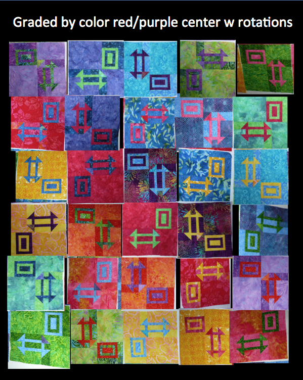
I am going to mull it over some more. But I think it is a contest between B and D, both with rotated blocks and some tweaks in block placement. I welcome any opinions and musings on the topic. One blogger once said that we should post on process and not as much on product and so there you have it. My thought processes. I would like to hear yours.
As for naming this quilt, my daughter said the churn dashes remind her of the number sign "#". She suggested "Rainbow by the Numbers". This may be appropriate if I go with Option D. To me it kind of looks like those football diagrams with O's, X's, arrows and lines of defense where the blocks are a playing field. Maybe I will name it "Thirty Yard Dash" or "Color Play of the Day". A quilt name, like your child's nickname, has to just happen. You can't force it.
And now for my work in progress stats...
And now for my work in progress stats...
Completed projects:
- Actually none, zippo, nada
Ongoing projects:
- This post's multicolored Churn-Dashish quilt
- Doll quilt - awaiting binding and a goal for this week
- Grinch quilt - on design wall for assembly and creative sashing solution
New projects:
- Actually none, zippo, nada
Stats since last WIP 1/2/13:
Completed projects - 0
New projects - 0
Currently in progress - 3, listing others does not mean they are in progress!