Since I introduced black with the previous block I chosen this batik to frame the fireplace image. It make me think of black soot and tongues of flames. It may be too dark when compared with the other blocks depending on how I separate or put sashing between them. I think it suits the image well but may be too far a stretch from the red/green/yellow used thus far. This fabric was also left over from that red, black, and white quilt I made for my nephew, Dean.
The fabric framing this next block was also a freebie given away inside a snowman cookie jar. I thought the little boxes imitated the presents the Grinch and Cindy Lu Who are holding. This does introduce another color, blue, to the green/red/yellow theme but the blue picks up the color of the bow on the gift the Grinch is holding. I think it goes great with the image but I am reserving judgment if it will fit in the quilt. If I change my mind, there are only four straight seams to take out... no biggie.
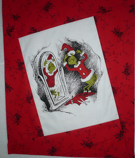
The frame fabric for the next picture could not be green because of the image border. The red fabric I picked is pretty mild and unassuming but the dots do echo the balls on the Christmas tree. Not all fabrics can be yelling out and competing for attention.
For the final block I picked a Grinch-ly Green with spots. Do you remember the Disney move The Sword in the Stone? There is a scene in there where Merlin and the witch Madam Mim are having a wizards' duel, turning themselves into different creatures to overpower each other. Merlin wins when, instead of becoming a bigger animal, he becomes a germ and infects Mim so she becomes ill. She turns green and is covered with spots- just like this fabric. See what connotation and memories fabrics can evoke? That is why this fabric speaks Grinch to me. Also, the spots are kind of like the holly berries on the wreath.
Here are the blocks assembled on my design wall. I do think the fireplace block and the block where Cindy Lu Who is holding a present kind of clash. The batik used on the fireplace and the calico-like print used on the present block do not have the same feeling though I can not quite describe it- probably because most of the framing fabrics read like a solid, but the calico like fabric does not. I may change the framing fabric on one or both blocks. I need to stop working on this for a while and sleep on it; then look at it again over the course of the next few days.
The fireplace block may look better with a red frame even though the lower Christmas tree image has a red frame and the fireplace block has a partial red border. Here are four alternatives to the black/red batik frame. I am sort of leaning toward repeating the fabric on the left. It is the same fabric I used on the block that was the cover of the Grinch book. That block was centered and not tilted and so is the fireplace block. I have very little of this fabric so the framing may need to be narrower with this option.
Alternatively, I am also considering splitting the dual image into two small ones. The pictures are not intertwined so that is possible. Each could be framed differently and both tilted, leaving only the top center cover block oriented squarely. Hmm... this idea has a lot of appeal. Gotta sleep on it.
And by the way, here is that red/black/white quilt that donated its leftover fabrics. Can you pick out the two red/black fabrics?


Looks good! I agree that to my eye, the "reads like a solid" fabrics are the most attractive. Personally I think you could get away with keeping the Cindy Lou Who Present and fireplace border fabrics if they weren't right next to the other 2 "here I am!" prints in the collection: I am not a fan of the super busy border on the grinch-holding-a-present block, but I think if you subbed that out for something more one-tone, the rest of the blocks would actually work really well. Also, remember that you can always put your loud, full-of-contrast prints in the little separator blocks if you make them.
ReplyDeleteI still like the black and red Cindy Lou Who border, but if you had to swap out, I would go for the stars on the right: I think the calico with its large, colorful print actually kind of competes with the smaller double image in the center. You could also pull out the blue from the presents, or the (dark) green from the stockings and have it work in the overall layout.
Also, I think splitting the two pictures but leaving them in the same block would be cool - then perhaps you could split it into two borders? I'm excited to see where this goes!