I was undecided on how to do blocks framed with the birdie fabric. I chose parallel lines alternately spaced either ¼" or ¾" apart. Sounds simple enough but on four out of five of these blocks I managed to mess up the spacing on at least one side. Look at the top right band. The spacing is ¼", ½", ¼".
Here is the framing corrected to ¼", ¾", ¼". Since overall texture is the goal, the difference does stand out from a distance even if up close the measurements look similar. The ¾" is pretty much the birdie height and so complements the print. I am pretty sure those few residual perforation marks from the picked out stitches will steam out.
Why did I keep messing up? I finally figured it out – I think. The ruler has alternating solid and dashed lines. Since I was using white thread and my stitch length was about the size of the dashes, I kept mistaking a stitching line with a ruler guideline. Once I recognized this confusion and knew to watch for it, I did better. Also another help was that I gave myself permission to turn the quilt instead of trying to sew up-down and also left-right. I could then stitch on a consistent side of the ruler, working my way from the inner seam edge of the frame to the outer perimeter. My poor brain could not handle sewing above or below or to the left or the right of the ruler, along with deciding the correct guideline to align.
For comparison, the incorrectly sewn frame is on the left, and the correctly spaced one is on the right.

Here is completed block done consistently and "correctly". Having alternating channel widths lends textural interest. I reminds me of a flat fell seam on jeans – without the seam and without the jeans.
It is hard to see the quilting lines in the next photo, even though I tried to take it at a steep light angle. My husband wonders why I fuss so much on what he says you cannot see. He has learned my lingo though. "Maybe it will puff up after it is washed," he concedes to please me. I learned that if I concentrated on going just outside the line I am following, by maybe an ⅛" or so, slight wobbles and glitches are not as visible and there is more room for the colored portion to pop out from the white background. And, yes, thank goodness my quilting is better than my drawing.

It is relatively simple but I like these ribbon lines. I just wonder if it is too much like the other frames with stripes.
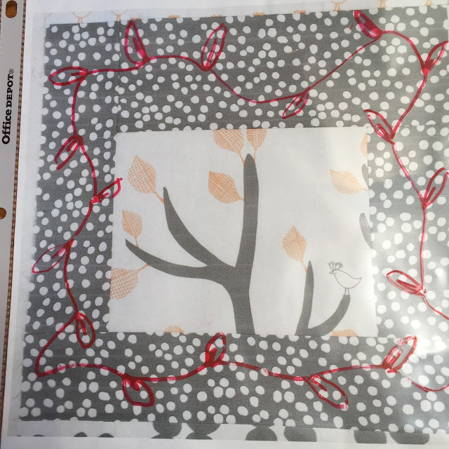
I do think this gentle wavy line with sporadic leaves is appealing. I suspect though, like the feather I tried, it just won't show up. Anything is visible with that bold red marker, but with a fine line of white thread...? That is another story.
I am leaning toward the meander amongst the dots, dense enough to cause the frame to recede. Aah, more decisions. That is indeed a difficult part of FMQ for me. I will now visit Let's Bee Social #136 and see if others have their two cents to add.


This quilt is lovely. I understand how the ruler lines could confuse you. I've been working on setting blocks on point for the first time and am shocked how 90 degrees is exhausting my brain! Have you considered pebbles in that dotted border?
ReplyDeleteI most certainly considered pebbles in that dotted border. They would look great - if someone else did them. My pebbles are awful. I guess that just must mean I should practice them. A friend did tongue in cheek suggest I could outline each of the dots...? HA! Thanks for visiting and taking the time to comment. It is also nice to have validation that my brain struggling is within the norm.
DeleteWell, I must say I simply adore this piece - the colors are so fabulous, and it has such a nice "sensibility." Hope you're going to share the entire finished piece...
ReplyDeleteThank you for such a glowing compliment - the piece does evoke a kind of happy vibe. I will indeed have one more post ( I think one will do it) showing the completion of my "Orange and Grey". Not a very inventive name but I have been using it enough I think it has stuck. Thanks for the visit and kind words.
DeleteEven though some of the stitching won't be visible, the texture will be and it will look fabulous. When I pick out stitches the holes will go away once I give them a little rub with my fingernail or the rubber tip of my seam ripper.
ReplyDeleteI suspect you are right about the holes from the picked out stitches. Besides, what is that saying..."If you can not see it riding by on a galloping horse, do not fret about it." Thanks, Beth, for the visit and comment.
DeleteThat 1/4" -1/2" - 1/4" quilting is such a simple concept, and yet it looks *awesome.* What a good idea! And, it might be time to research which battings puff up well!
ReplyDelete