Saturday, December 31, 2016

Vineyard Furrows Completed

My initial post on this piece, dated December 28, 2016,  left off at the stage where I was assembling wedges. The sections, then very close to final assembly, are all joined now.


I removed the central widest section from the S-shaped double spiral and trimmed off the jagged outer edge.


I added smooth contours to that center section to fill out the corners, at the lower left for ground and at the upper right for sky.


For the backing, I picked this bluish green as a bit of a surprise. This hue, though not dominant, is present in small doses in the brown/gold/green/blue pixellated fabric. Although I think this is meant to be chicken wire, the twisted portions made me think of grape vine tendrils entwined along a guide wire.


See the similarity in this photo of a typical grape vine?


I auditioned a variety of FMQ patterns – spirals, feathers, leaves, loops – and decided that plain contours echoing the hillside were simple and effective and did not compete with the furrow fabrics themselves.


Next was the decision on the spacing of the smooth curves. I drew them at two distances apart on clear sheet covers and decided which spacing I preferred. I would use an echo foot to keep my lines uniform and parallel.


I went with the wider spacing. The scale seemed correct and there would be fewer distracting stitching lines.


I opted for a purple-toned variegated thread to add a bit of interest. I reasoned that a solid thread would show up well on some fabrics and be hidden on others, but with a variegated thread, the light or the dark would peek out at one point or another on all fabrics.


I did deviate from the gentle contour plan for the lower left corner where I thought pebbling would imitate the alluvial soil that grapes thrive in. I had to decide on a pebble size and drew several options. I wanted to have in my mind a target pebble size so I picked the size of the red circles on the polka dot fabric. 


It turns out they are the same size as the inner diameter on my standard hopper foot so I would have a reference nearby as I stitched. Deciding on an FMQ pattern depends as much on what would look good, as on what my skill level allows me to quilt reasonable well. Having a size reference nearby would help me with my pebbling.


The pebbled quilting looked like this. This is not as perfect as I would like but the circles are getting rounder and the stitch length is growing more consistent. Progress.

  
In the upper right snippet of sky I planned to some wavy lines like air currents and allowed myself a few swirls to remind me of gently wafting breezes.


Once trimmed, I realized there would be less room for swirls than I anticipated but I did sneak in a couple by snugging them up to the hillside. But that is where eddy currents would occur anyway.


Quilting completed, I built up my nerve and slashed 1" to 2" off each perimeter edge so the piece in landscape format measured the prerequisite 16"x20". Next was my binding choice, where I had to make up my mind if I wanted the binding to pop or blend in. But blend in how? With the purples? With the greens? I kept an open mind as I surveyed my stash and, for some inexplicable reason, a peculiar yellow irregularly shaped dot appealed. No matter how many others I auditioned I was strangely drawn to this one. I rationalized that it picked up the gold splotches in the pixellated fabric. In my mind, the closest contender to the yellow was this vibrant plum plaid but I was afraid it was so geometrically rigid, that any straying off grain would compromise the tidy look of the binding.


I thought if I kept the binding narrow so it would be an accent, not a distraction, I could be bold and take a chance on the funky off-yellow. Then I laid the quilted piece on the two choices and compared the funky yellow spots side by side with the plum grid. Even though narrow, the yellow was more jarring than amusing. I went with the plum. I also convinced myself it represented the fence line surrounding a vineyard. Yes, I chickened out. The plum was safer. But I had to admit it also looked better. I would find another use for that funky yellow inverse egg yoke fabric that so tickled me.


I expended the effort to fussy cut the plum grid binding directly on the white lines. I know that is a bit anal but I wanted to avoid the look of those lines wavering. After pressing the fussy cut strips in half, I went back and shaved off a sliver so the binding would measure 1⅛" when doubled and work out to be the ⅜" width I am used to sewing. 


If you have stuck with reading along this far, the next photo is a somewhat anti-climactic reveal. For completeness however, here is the bound, completed, wall hanging, to be submitted for a Colors of the Vineyard challenge. 


I added two labels on the back, one for the title, Vineyard Furrows, and one with my name and the date. The date is 2017 because that is the year of my guild's quilt show where, in April, I will submit it as a challenge piece under the theme Colors of the Vineyard. Despite the label to the contrary, I am counting it as a 2016 completion, my last one this year.


What puzzles me now is whatever will I do with these leftovers? Those two spiral ends must be good for something...Any ideas? What do they bring to mind for you?

This half makes me think of Alice's Adventures In Wonderland as she spirals down, down, Down the Rabbit Hole.


This half makes me think of Kermit the Frog singing The Rainbow Connection.


Technical quilting question to start out statistics for the new year – do these two spiral orphans count as UFOs or as scraps? Happy New Year 2017!

Update: I am linking up to Let's Bee Social #158 since previous visitors to the first post on this project expressed an interest in seeing the results.

Wednesday, December 28, 2016

Vineyard Furrows

When my guild was hosting a challenge called Colors of the Vineyard. We were to produce a 16"x20" wall hanging that evoked a sense of scenery of the wineries around our local Livermore. The grapevines along the rolling hills are so pretty and I wanted to capture that feeling in both color and motion. I wanted to conjure up a vision of plowed furrows where the grape vines are planted.


About 5 years ago, I'd made two spiral table runners; a fall colored one with a 9° wedge ruler and a turquoise and grey one with a 10° wedge ruler. The center section of the table runner reminded me of shapes and undulations of the plowed furrows in a vineyard. I would use the same pattern as my starting point for the challenge piece. The 10° wedge would give me a shape closest to the 16"x20" rules of the challenge. An entire table runner would look like this. I would change the colors and use only a portion of it, most likely the center.


The same runner with the tips folded under looks like a sloping hillside to me. I would need to fill in above and below to make it rectangular for the challenge.


My color selections call to mind a vineyard: purple tones for the grapes, green tones for the leaves, and brown tones for the earth. I originally had a blue hue in the mix for the sky but it seemed to throw things off. I ordered the colors to have purple interspersed with green.


I labeled each of my strips cut from fat quarters with my set of Alphabitties and Wonder Clips. I used to store my Alphabitties in a lockup container when I wanted to use the I would dump out all 36 and paw through the pile to find the ones I needed. Then I tried storing them with a Wonder Clip attached to each. It took up a bit more space but it separated them from each other better to look for the correct one and also enabled me to pick up both letter and clip in one motion.


Then I had an idea for a yet different method of storage. My husband is a stamp collector and he has these handy-dandy binder pages for storing stamps until they are assigned to an album. He is laid up for a bit because he recently fractured his hip when he fell off a ladder installing our master bedroom drapes - see my December 21. 2016 post. His physical mobility is restricted while he heals and consequently he is a bit bored and seeks sedentary activities, He was happy to try this organization of my Alphabitties for me. So far I like it. Seeing him sitting there is so characteristic of him sorting his collection - only for stamps he uses tweezers to prevent oil from his fingertips from devaluing them.


The clear plastic row windows allow me to see the letters and numbers and slide each out easily from the top. It is serendipitous that there are six rows that just fit six each to house the entire set Alphabitties so they are visible and accessible and lets me know at a glance if I am missing any. Good job, Frank! Thank you for sharing your philatelic tools with the quilting community! I will give this storage method a try for a while and see if I like it.


After labeling my color for strips, I also used the I used these Alphabitties to keep track of the different size wedges I am assembling.


After making banding sections of the cut strips I cut them into varying height wedges of two sequences - bright green to brown and brown to bright green.


Then I started sewing the wedges together in offset pairs. I am beginning to see those tidy rich toned rows of grapevines emerging.


I have a ways to go. I will link up briefly to Lets Bee Social #157 and then get back to assembling these wedges.

Sunday, December 25, 2016

Bunny Pillow

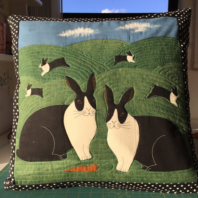
I spotted a bunny fabric panel on the giveaway table at a guild meeting. As the saying goes, one man's trash is another man's treasure. My son Alex loves bunnies so I decided to make it into a pillow for him. Here is Alex with his bunny.


I did not  think to take a photo of the panel before cutting off the trim but a quick Google Image search with the phrase "colonial bunny fabric panel" yielded this result.  It has poor image quality but you get the idea. My freebie was the bottom right quadrant only of this panel.


I cut off the checkered bordered with the black silhouette weather vanes - and did I discard that 18" strip? Of course not! You just never know when it will be the exact accent needed somewhere.
I realized I could update the panel by trimming off the narrow dated colonial beige and olive green border. The narrow accent also had small red hearts that did not give off a masculine vibe. I would substitute a black mini-print of some sort. The bunnies were such a close match to Alex's pet I could not pass it up.


For the back I chose a black and white funky uneven stripe. (It was left over from a lamp I revamped in my post for April 4, 2014.) I sandwiched the striped backing with a piece of bamboo batting and lightweight flannel backing to give the pillow surface a bit of substance and not wrinkle as readily. I used the sandwich as an opportunity to practice my FMQ on my HQ Sweet Sixteen. The lines are intentionally not ruler straight to retain the feel of the uneven stripes. I could have done this on my domestic Pfaff but I wanted to grow my FMQ skills. The longarm also has the added advantage of being able to stitch backward as well as forward. I FMQ'd only the white stripes so the black would stand out and give a textural feel to the surface. I kept the spacing uneven to add to the casualness. The result was subtle but worth the effort.


The stitching is more obvious on the flannel back, but that will be hidden on the inside of the pillow.


On the bunny panel itself I followed the contours of the hills and left the bunnies un-quilted so they would raise up. My hills contours looked relaxed, an effect I intended. I will confess however, were I more skilled, I would have had more control over the degree of "relaxation".


But the bunnies did stand out, as did the carrot. I used my domestic instead of my HQ16 to stitch in black along the black/white interface of the bunnies' bodies. I did not want to quilt that short isolated line in green nor did I want to wind a longarm bobbin in black for that little bit.


The clouds in the sky above the  bunny romping in the distance called out for some fluffy white scribbles.


Here is the back of the quilted panel before assembling it into a pillow.


I added a zipper at the bottom before sewing the outer seams of the 18" x 18" pillow.


Here is the front of the completed pillow. It was just chance but I am bemused how the blue sky and cloud from my sewing room window is peeking above the pillow when I took the photo.


Here is the back. The quilting and textured gave it just the spark it needed to keep it from being boring.


After I'd uploaded the previous pictures and written this post I discovered on the computer screen that I had missed a spot of quilting right smack dab in the middle of the pillow front! Can you find it? I did go back and add it and take the following detail photo before I gifted the pillow. Hint – its omission is easier to spot in the all-white flannel view.


On Christmas Day, Alex opened up his bunny pillow present. He liked it. He is patting his chest as his sign that rabbits hop!


This came out cute enough that I am linking it to Let's Bee Social #157 to share.

Wednesday, December 21, 2016

Completion of Master Bedroom Curtains

My previous post about these curtains was at the end of October 2016 and titled Saga of Curtains for Master Bedroom. That post described an abandoned design plan, some back-to-the-drawing-board revisions, and a few angled pleat challenges, but I persevered. I am calling the curtains completed but not without a lot more drama. The curtains are stationary and hang by drapery hooks looped into eyelets screwed into a mounting board. The wood piece, outfitted with a row of eyelets, is then attached to an L-shaped bracket that is screwed onto the wall.


The curtains are now up, but the installation job started by my husband, Frank, had to be completed twelve days later by my son and son-in-law, when they were here visiting. We have a new interpretation of the twelve days of Christmas.


During the final stage of driving the screws through the bracket and into the wall, in order to reach high enough up into that vaulted ceiling, my husband set a step ladder within the window seat and stood on the lowest step. He pushed on the drill but the drill pushed back. Frank slipped off the ladder, fell to the hardwood floor below, and could not get up due to extreme pain. After a call to 911, an ambulance ride to the hospital emergency room, and an X-ray diagnosis of a fractured hip, he underwent surgery for an emergency complete hip replacement. I captured a photo of him on his way being rolled into the operating arena. His two thumbs up are somewhat half-hearted but he did joke with me, "For your blog, right?" Twenty three hours after he fell, Frank became a bionic man and would be laid up for weeks and position-constrained for months.


It is ironic. The bedroom redecorating has been in the works since September 2014 when Frank laid the hickory hardwood floor. We fussed over the plank arrangement enough that I dubbed a post about it a Wooden Quilt. Frank was dismayed that he'd fallen, yes but also somewhat annoyed. As the paramedics were scooping him onto a metal stretcher he directed them, "I installed this hardwood floor. Don't scratch it!" The curtains are finally up now but Frank cannot enjoy them since instead of sleeping in our second floor bedroom he is relegated to the hospital bed set up in our first floor living room. He will see the finished room eventually but for now, until he progresses to climbing stairs, he will only see the room in my blog pictures. I have not slept in our master bedroom either. Frank came home from the hospital December 3rd and I have been sleeping on the couch next to the hospital bed until I am certain he will not need my assistance during the night. Sleeping with the bathing beauty pillows on the bed (made at the end of June 2016) will need to wait, too. Although now that I think of it, I could bring them down to the hospital bed, but that is not quite the same thing.


The window on the side has only a valance. That was all there was wall space for with the metal sculpture off to the left. In the corner is a Funstripes Jeffan rattan chair and a rope floor lamp. 


Working the view counterclockwise around the room are the other theme pieces. There are beach umbrella pillows on each side in the corners of the window seat propped on striped seat cushions that match the drapes. I blogged about Velcro closing those striped seat cushions in my post for November 23, 2016.


Above the half circle shutter is a Beach House sign. Below the window in the center is a lumbar shaped accent pillow and beneath it a long framed poster showing a white adirondack beach chair with a coral scarf blowing in the breeze, an inspiration for the window seat color.


On top of our armoire is a funky painted metal art piece we bought just because it made us smile.


There are some small details for the drapes remaining that shall remain undone. For example, a small dowel wedged behind those drapery hooks and against the plank, underneath the eyelets, will push the pleated header more upright and vertical instead of leaning forward as it does now. I'd also intended to paint visible parts of the mounting board and glue a strip of sisal rope on the raw exposed edge end. For now I am calling it good though. Neither I nor my husband are getting up on a ladder anytime soon!

You become aware of all the friends you have when you get laid up. There have been numerous phone calls and visits from well-wishers. We even have a generous supply baby sitters, folks who gladly and willingly come and stay with Frank while I run errands since I do not want to leave him alone. I am happy to be social now as well, but in the online way. I am off to link up to Let's Bee Social #156.